Website Navigation
Transformation of ZoomInfo's navigation to prioritize user journeys by use case and persona.
The Problem
ZoomInfo's new brand house and visual design system meant the existing website navigation no longer fit the core products. The design had also become disjointed from a series of small updates throughout the years without a cohesive evaluation of its organization and effectiveness.


Research
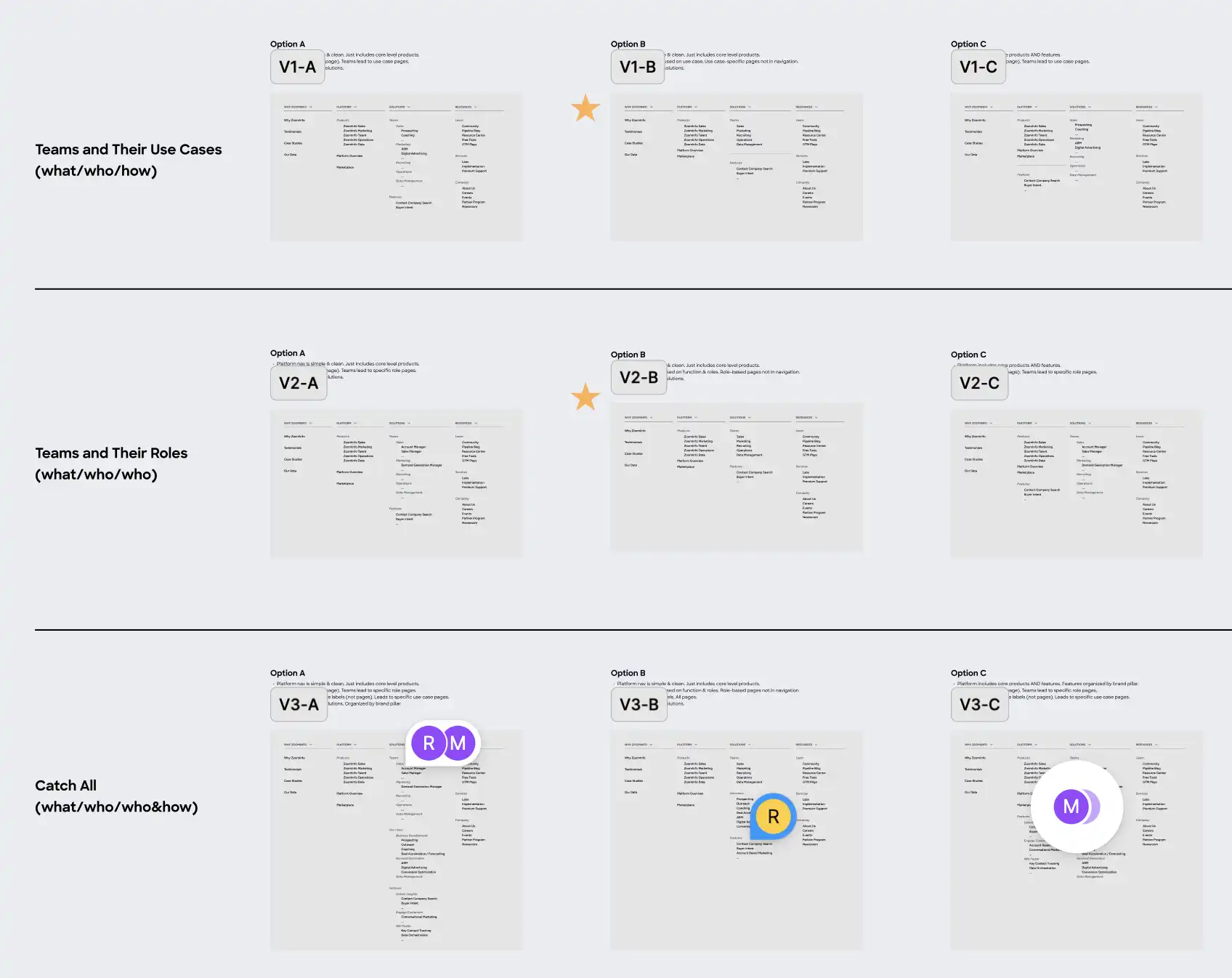
We began the project with user research, including unmoderated user testing on our existing solution, tree studies on the proposed structure, and competitive analysis to understand our weaknesses and opportunities. We tested a hypothesis to break down the navigation by persona and use case, and iterated on the placement of our top converting pages.


Opportunites
The former solution was clunky from a series of small, disjointed updates. We opted for a clean structure that could easily be tested and added to.
Through reorganized dropdowns, we prioritized the "why" of ZoomInfo and offered opportunities to consider value props by industry, business size, and use case.
The navigation was constructed with a plan for continuous multi-variant testing to optimize link placement and copy.
The design provided an opportunity to release a new navigation component that is 100% AA compliant for contrast ratios and touch targets.
The Design
The team utilized high-fidelity wireframes and prototypes to gather feedback and conduct further testing. The final designs are clean and easy to iterate upon as our product frequently evolves.


The Results
Throughout the months post-launch, the team continued to iterate on the design based on conversion data. In partnership with the web strategy team, we tested adjustments to button copy, link location, and the addition of a sticky nav that keeps the primary conversion button front and center throughout the page experience.